Every Friday, a status report goes out.
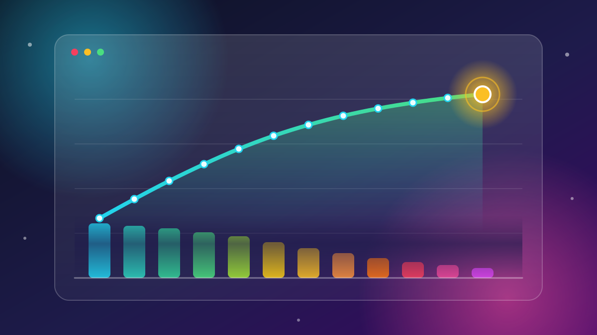
Eight charts: budget variance, schedule adherence, scope changes, risk register, resource utilization, defect counts, velocity trend, and a RAG status summary.
Every number on it is accurate. Every chart is built correctly. And almost nobody reads past the first one.
This isn't a data problem. It's a narrative problem. A report full of correct charts is not the same thing as a story that gets someone to make a decision - and most status updates only ever manage the first one.
This is the third post in this blog's data analysis thread. Exploratory Data Analysis is an Art was about exploring data honestly before drawing conclusions. Your Project Dashboard Is Lying to You (Gently) was about how summaries can look healthy while hiding real problems. This post picks up where those leave off: you've explored the data, you understand what it's actually saying - now how do you get a stakeholder to act on it?
Reporting Answers "What Happened." A Story Answers "What Do We Do?”
That's the entire distinction, and it explains almost everything else in this post.
A report organizes numbers by category: budget here, schedule there, risks in their own section. It's comprehensive, it's neutral, and it asks nothing of the reader.
A story does something different - it takes a position, explains why it matters, and points at a specific decision.
Compare these two ways of saying the same thing:
Reporting: Budget variance: -8%.
Story: We're on pace to overspend by $40K unless we cut scope or get two more weeks. Which do you want?
Same underlying number. One is a fact sitting on a slide. The other is a decision waiting to be made. The second version is harder to write, because it requires you to interpret the number and commit to what it means - which is exactly the step most status reports skip.
The Anatomy of a Data Story that Drives a Decision
A story that actually moves someone to act has a repeatable structure.
It's four parts, in this order:
- The headline. One sentence stating the situation - not a chart title.
”Launch is at risk" is a headline.
"Q3 Metrics Overview" is not.
If a reader saw only this sentence and nothing else, would they know what's going on? If not, keep rewriting it. - The one chart that matters. Not all eight charts - the single visual that proves the headline true. Everything else is supporting material, not the main event.
- The "so what." The consequence if nothing changes.
This is the sentence that turns a number into a stake: "if this continues, we miss the launch date by three weeks." - The decision or ask. The specific choice you need from the stakeholder, ideally framed as options rather than an open question.
"Which do you want?" is weaker than "Do you want to cut scope, extend the deadline, or add a contractor?"
Everything that isn't in service of these four things becomes an appendix. It's still there if someone wants to dig in - it's just no longer competing with the headline for attention.
The Hardest Skill isn't Visualization it’s Editing.
Building eight charts is easy once you know the tool.
Deciding that seven of them don't belong in the main narrative is the hard part, and it's the part most reports skip.
There's a reason for that: A report with eight charts and no clear position is comfortable to send, because it doesn't require you to commit to an interpretation. If you're wrong, you can point to the fact that you "reported everything.”
A story with one chart and a clear ask puts your judgment on the line. That discomfort is exactly why most status updates default to reporting instead of storytelling - and exactly why storytelling is the more valuable skill to build.
A simple test: If you can't explain in one sentence why a chart needs to be in the main narrative, it belongs in the appendix, not the headline slide.
A Worked Example
The situation: A project's scope has grown 15% since kickoff, and the team's velocity has been flat for the last three sprints.
The reporting version:
- Scope: 15% increase since baseline
- Velocity: 42, 40, 41 points (last three sprints)
- Budget: 92% consumed, 78% of timeline elapsed
- Risk register: 6 open items, 2 high severity
- Defect count: 14 open, 9 medium priority
Correct, thorough, and it tells the reader nothing about what to do. They have to do the synthesis themselves - and most won't.
The story version:
Headline: At current pace, we'll deliver 15% less scope than promised, or need three more weeks.
The one chart: A simple line showing planned scope vs. completed scope vs. current velocity trend, with a projected finish line for the original date and a second line for the realistic date.
So what: If we hold the deadline, we ship without the reporting module and the mobile view, based on current velocity. If we hold full scope, launch moves from June 1 to June 21.
The ask: Do you want to cut scope to hit the date, extend the date to keep full scope, or add a contractor to close the gap? (Contractor option adds cost but keeps both date and scope roughly intact.)
Same underlying data.
One version is a status update. The other is a decision a stakeholder can make in the length of one email reply.
One Story, Two Altitudes
The same underlying finding needs different levels of detail depending on who's reading it, but it should never need a different headline or a different ask.
- Executives want the decision and the risk. Headline, one chart, so what, ask - and stop there. They don't need the velocity calculation methodology.
- Peers and team leads want enough detail to act on it operationally - which sprints were affected, which tickets are driving the scope creep, what the contractor option would actually involve.
So, write the executive version first. Then add a second layer underneath for anyone who wants to go deeper.
What you should never do is give the executive version the operational detail up front - that's how you end up back at eight charts and no headline.
Common Mistakes that Turn a Story Back Into a Report
- Leading with methodology instead of the finding. Nobody wants to hear how the velocity chart was built before they hear what it means.
- Including every metric "just in case." If a stakeholder might ask about it, have it ready in the appendix - don't put it in the headline slide preemptively.
- Presenting options with no recommendation. "Here are three options" without a view on which one you'd choose just moves the analysis burden back onto the stakeholder, which defeats the purpose of doing the analysis at all.
- Burying the ask at the end. If the decision you need is on slide eight, most readers will never reach it. Put it in the first sentence, then justify it.
The Conclusion
Exploring your data honestly and knowing what your dashboard hides are only useful if the resulting insight actually reaches a decision-maker in a form they'll act on.
A story is how an accurate finding survives contact with someone who has four minutes and six other status updates in their inbox.
The next report you send, try cutting it down to one headline, one chart, and one ask - and see what's actually left once you remove everything that isn't in service of a decision.
In bocca al lupo